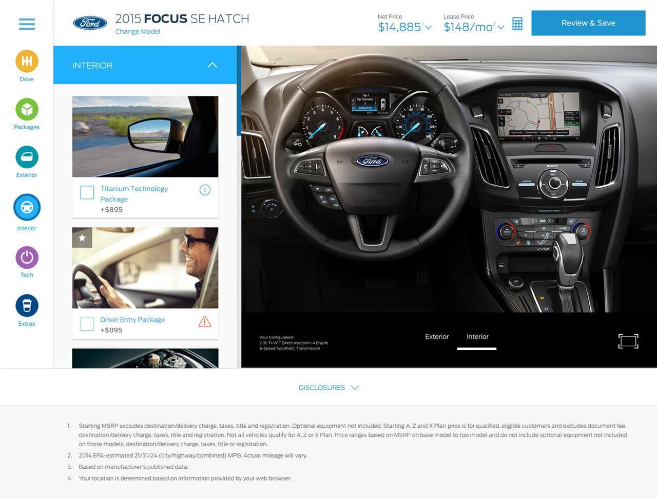
A responsive vehicle configurator that lets buyers customize, price, and locate any Ford on any device, built on a modular component system rather than fixed pages.
Configuring and pricing a vehicle online was complex, inconsistent across devices, and modeled around how Ford organizes cars rather than how people shop for them.
UX Architect, leading the information architecture: I owned the structure, the modular component architecture, and the research-driven decisions, from research through testing.
A mobile-first configurator that meets buyers where they are and carries them from building a car to locating and buying it, validated by shoppers across three global markets.
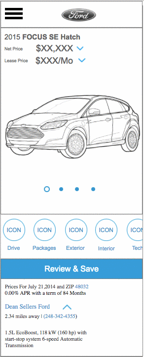
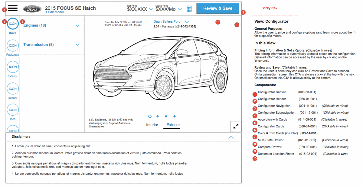
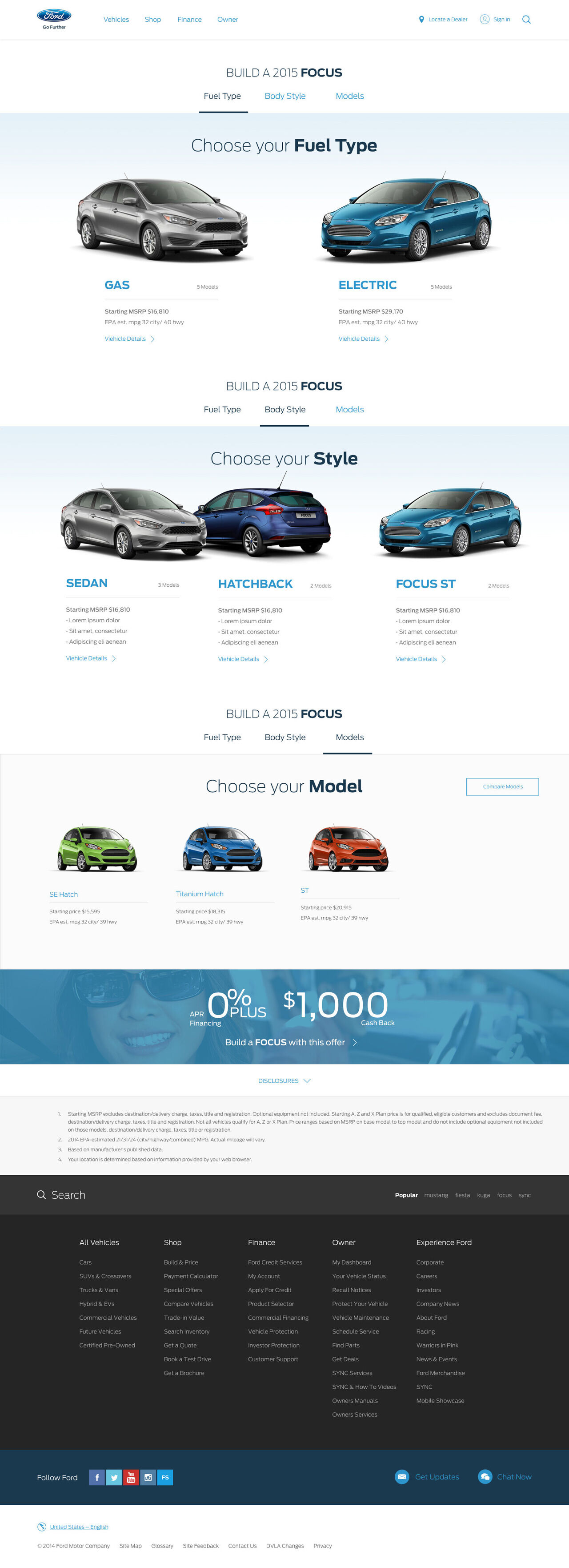
Modular responsive components, each with a small, medium, and large layout.
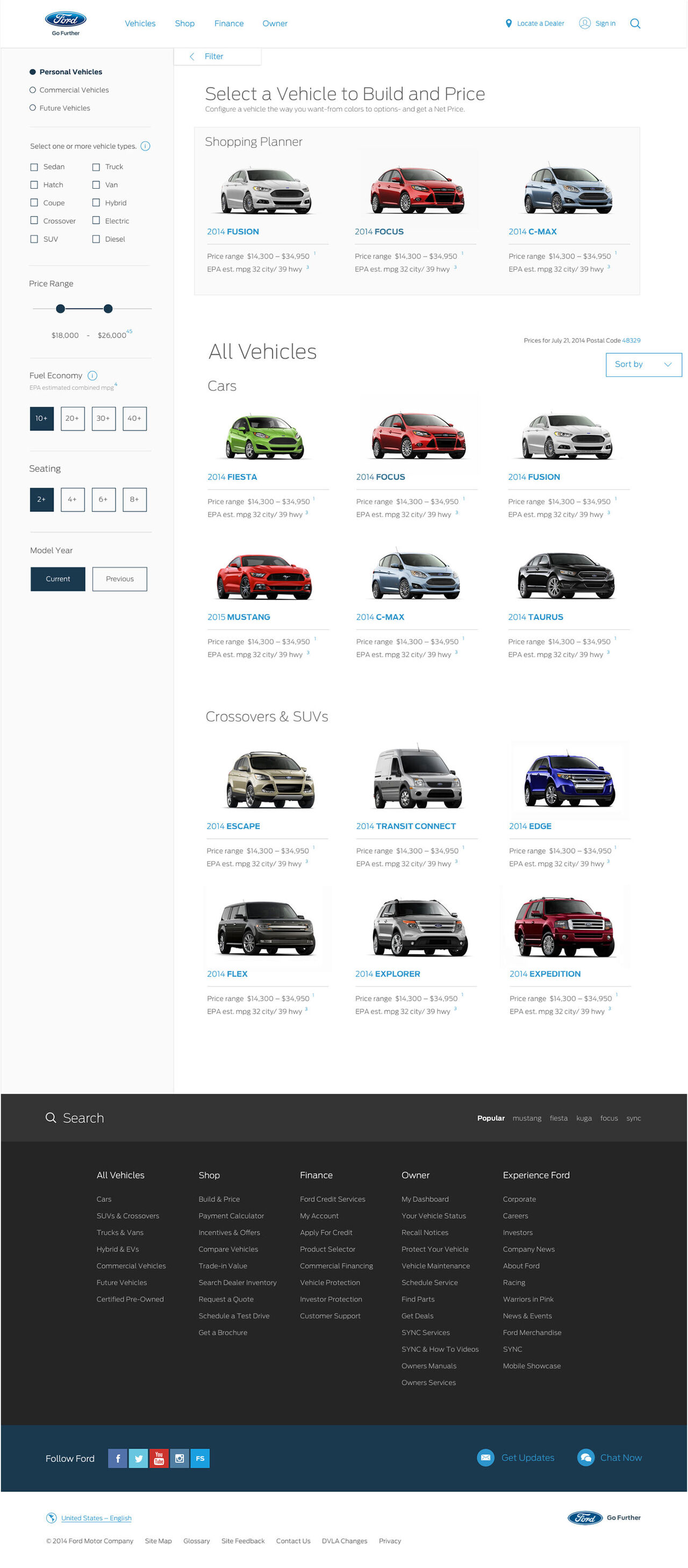
Buyers see vehicles at the vehicle level and filter by type and budget, because global markets do not recognize Ford model names.
I modeled the customizer on the familiar patterns of the apps people use daily to edit and share images, cutting the learning curve.
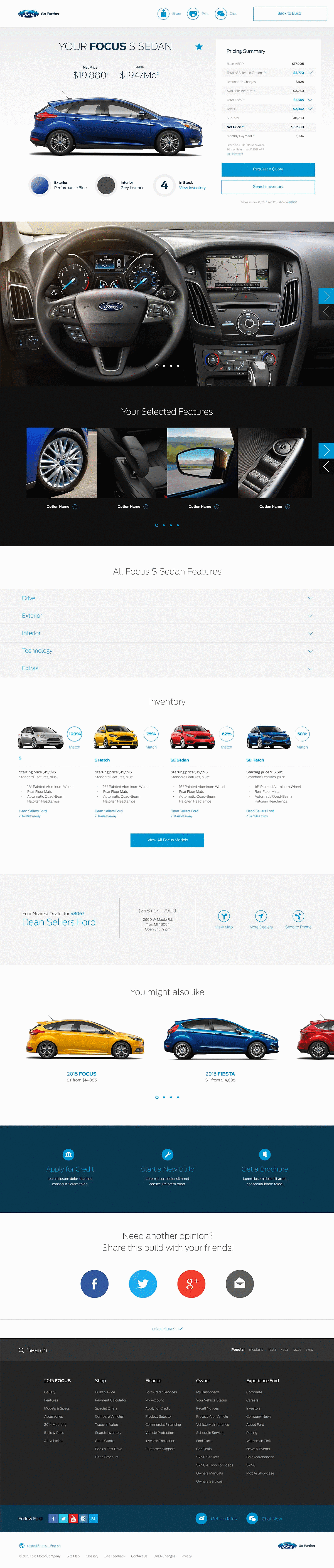
I started mobile first, the most useful constraint in this kind of work because it forces priority. On a small screen you cannot show everything, so every piece of content has to justify itself. The bigger structural decision was to design components, not pages. I built a library of responsive components, navigation, vehicle cards, feature cards, pricing, each with its own layout for small, medium, and large screens. Thinking in modular parts kept the experience consistent and far easier to develop and launch on a global scale. This was design-systems thinking, years before the term was common.
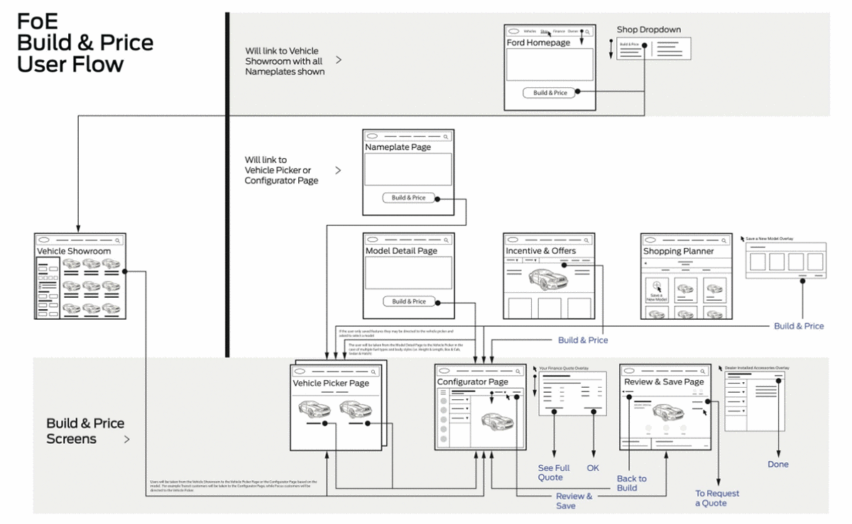
The first big question was whether to show results at the vehicle level (Ford Mustang, Ford Focus) or the model level (Mustang GT, Focus ST). Research answered it. In many global markets, shoppers were not familiar with Ford's vehicles, let alone the trim names, so a model-level list would only confuse the people it was meant to help. We also learned the two biggest factors in a buyer's mind were vehicle type and budget. So I let the data prioritize the filters: show vehicles at the vehicle level, and let people narrow down using terms they already understood. Sometimes the fastest path is to stop guessing and ask.
Most vehicle configurators were linear, step-by-step flows, and I did not want that. So instead of studying other car tools, I asked a different question: what do people already customize on their phones every day? The answer was images and video. I borrowed those familiar editing patterns and applied them to building a car. That single move cut the learning curve for new users and made customizing feel less like operating software and more like something they already enjoyed.
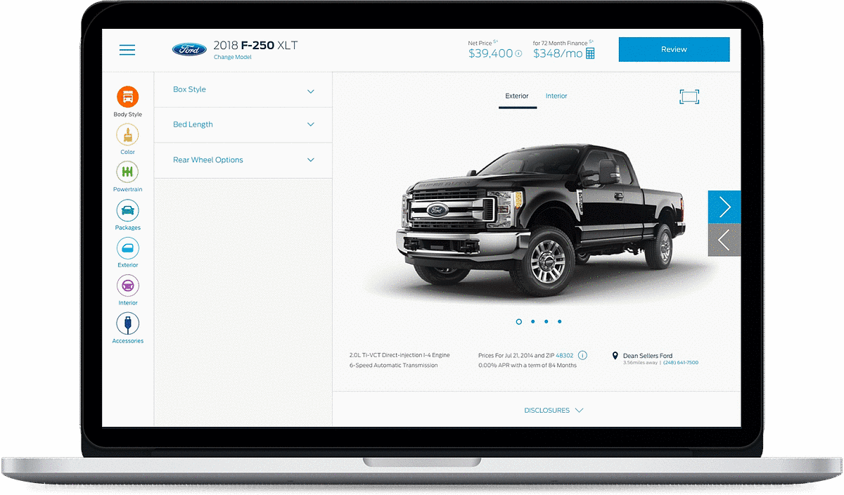
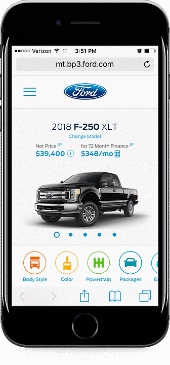
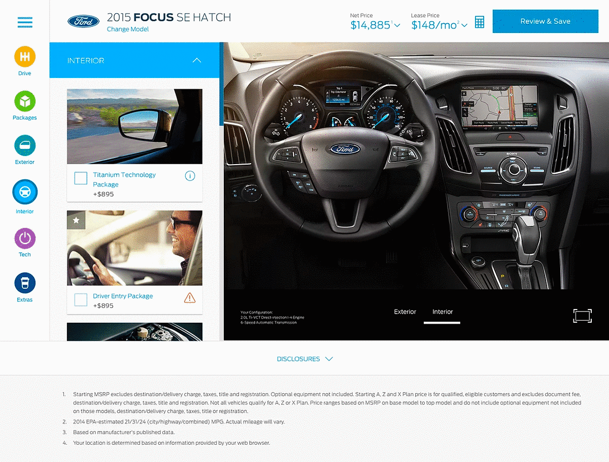
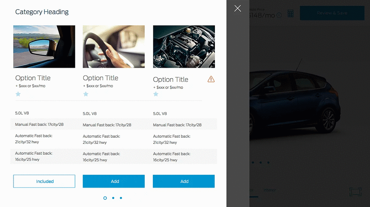
Pricing is one of the moments a purchase is won or lost, so it could not be buried. I kept price present and dynamic: on every feature card, and a running net and lease price always visible at the top, updating live as the build changed. For features themselves, a card carried an image, name, and price, plus an information control for the deeper detail a buyer occasionally needs, surfaced without interrupting the flow. An informed buyer is a confident buyer, and confidence is what carries someone into a dealership.
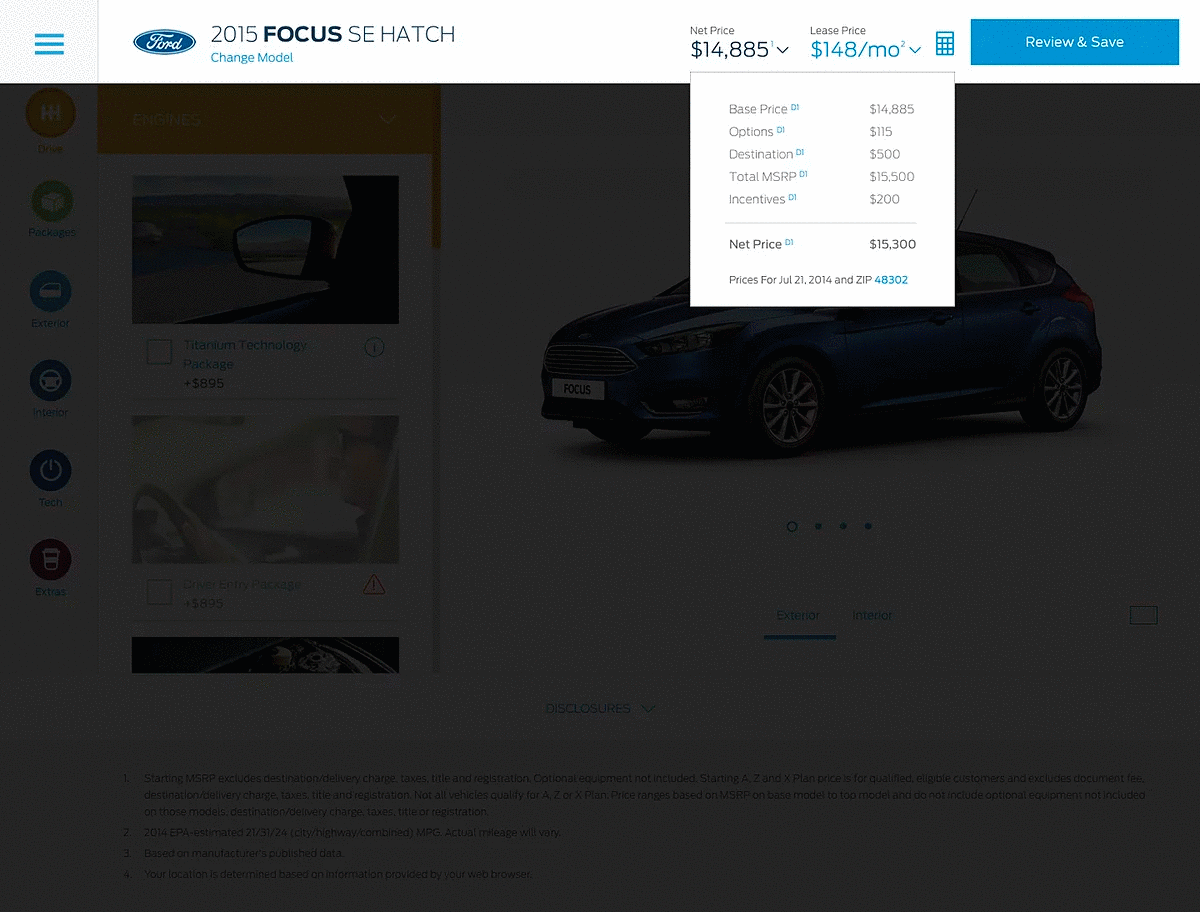
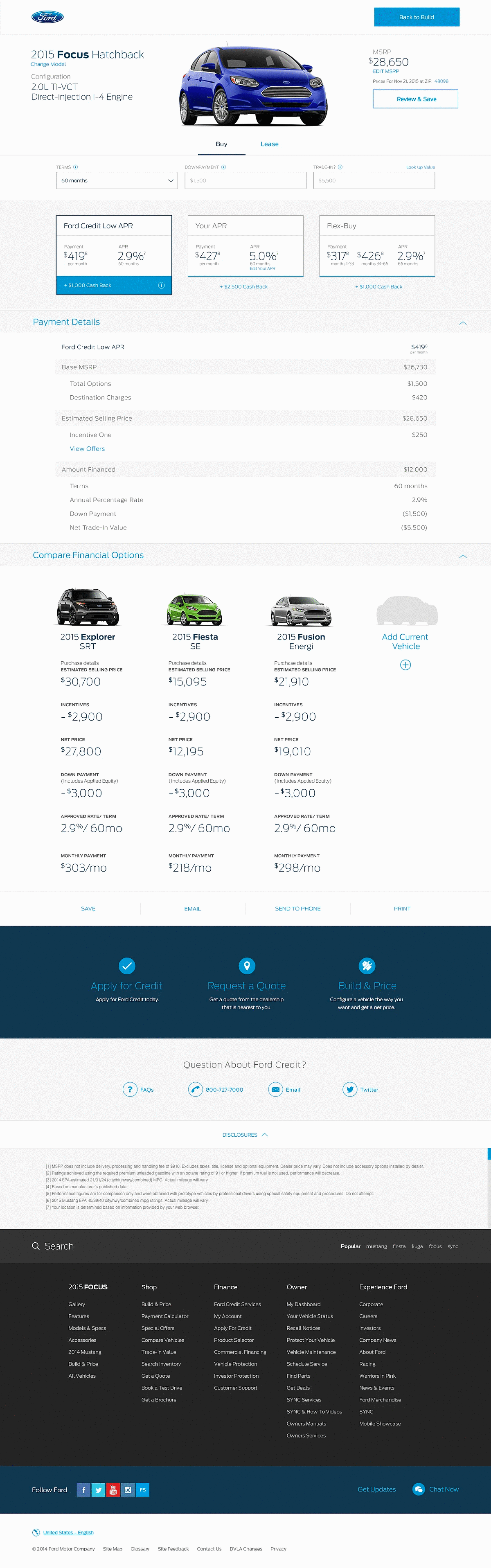
A fully built, fully priced car is not the end of the journey. I designed a payment calculator so buyers could compare ways to pay, with pricing cards that laid out monthly payment, APR, and incentives side by side. Then an Inventory and Locate a Dealer step that found the nearest dealer and the best-matching vehicles in inventory, and let the buyer email or print their exact build to bring in. The digital journey connected to the real-world one, instead of leaving the shopper at a wall.
We tested both the mobile and desktop designs across the US, the EU, and Asia. Many shoppers had never used a tool like it, and they liked its interactive, visual nature. That is the outcome the tool was designed for.