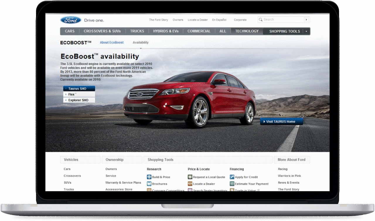

Before (15 elements) and after (7).
Re-architecting Ford.com's primary navigation around the car-buying journey, and cutting it from 15 top-level elements to 7.
Ford.com's navigation had grown cluttered and was organized around Ford's structure, not the way people actually shop for and live with a car.
UX Architect, leading the information architecture, using testing and analytics to prioritize and restructure, through prototyping and validation.
A cleaner, lifecycle-based navigation that more than halved top-level complexity and helped global buyers find the right vehicle faster.
Before (15 elements) and after (7).
The first job was to cut clutter without cutting value. Using testing and analytics to see what people actually used and needed, I prioritized the links and re-architected the top-level navigation from 15 elements down to 7. More than halving the top-level choices reduced cognitive load and made the whole site feel calmer and more confident.
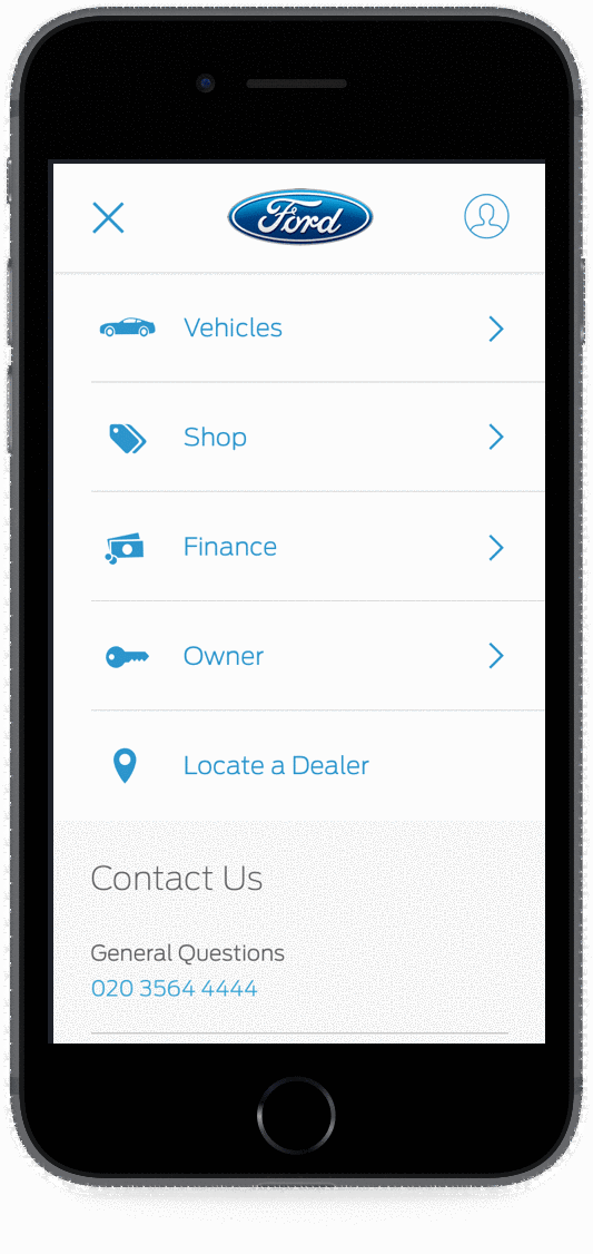
A navigation should help people move through a decision, not just list destinations. Exploring options, choosing the right one, paying for it, and owning it are the real stages of buying a car, so I restructured the navigation around that lifecycle. The site started guiding people through the journey rather than mirroring Ford's internal structure.
Categorizing vehicles into familiar segments was a start, but the same global research behind the Build & Price workstream surfaced a sharper problem here too: in many markets, buyers were not familiar with Ford's vehicle names, so a list of names alone was not enough to make a decision. So I brought vehicle images and pricing into the navigation across all screen sizes, the two factors research identified as the biggest decision points. People could now recognize and compare vehicles visually, regardless of whether they knew the names.
Navigation is one of the purest information-architecture problems there is: every decision is visible, and there is nowhere to hide complexity. The win here was discipline, using real evidence to cut to what mattered, then organizing the rest around how people actually move through a decision rather than how the company is structured.