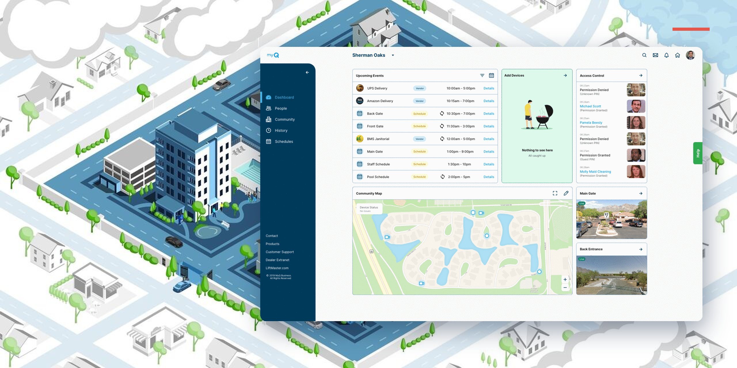
Re-architecting a 10-year-old, feature-bloated platform into one clear system for the community managers and residents who live in it every day.
From design work and usability testing.
Ten years of features bolted on with no plan left the platform stuck in the build trap. The navigation was a Jenga tower, and setup took a week of calls.
Lead UX Architect. I led the information architecture and directed two designers and a BA across the manager and resident apps, from research through testing.
A self-serve platform organized around how community managers think, with whole sections of complexity removed and no function lost.
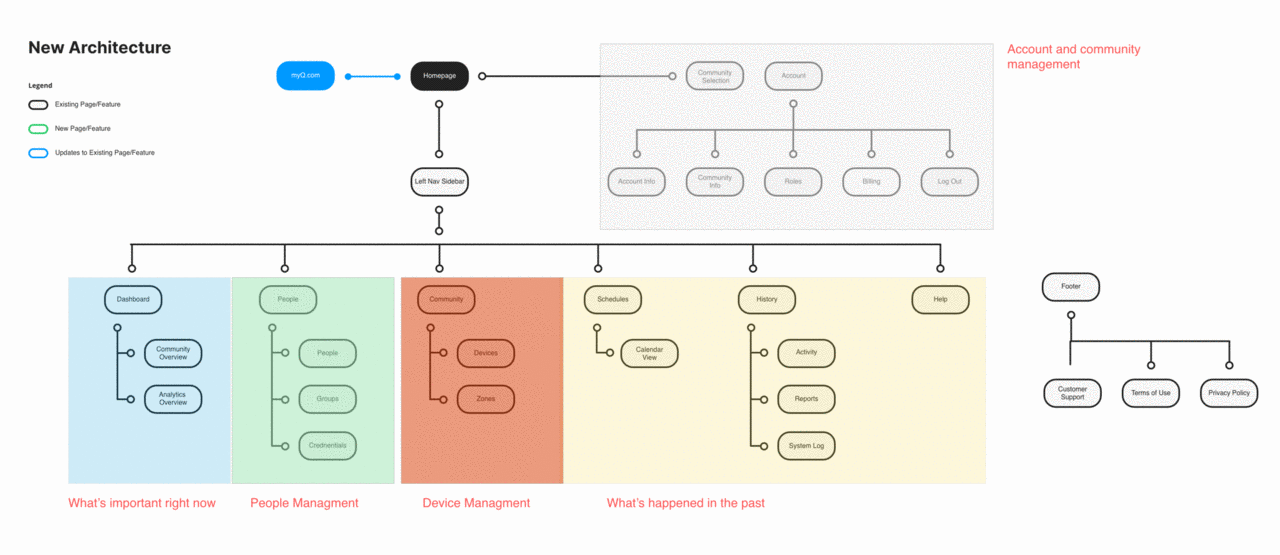
A pile of menus became six clear areas: dashboard, people, devices, history, account, help.
A flow every tester failed on the first try became one setting on the group page. A whole section was deleted, and no capability was lost.
Hours of calls became an online wizard that recommends the right hardware and licenses. 12 plans priced by device became one, priced by gates, doors and residents.
Chamberlain Group is one of the world's largest makers of garage door and gate controllers. Its hardware was best in class; its software was not. With smaller rivals racing toward end-to-end solutions, that gap was a business risk, so the company decided to rebuild the platform from the ground up.
For ten years, teams had added features with no shared plan. The navigation became a Jenga tower: each new feature made it shakier, confusing users and slowing engineering, because features that are hard to model are hard to build and easy to break.
As one of the first UX hires, I called out the habit of putting every device setting on a screen. It worked, and nothing was technically broken, but it was not how customers thought about their communities.
The core of the work was information architecture. I stopped organizing the platform around the company's feature history and organized it around the questions a manager asks during the day.
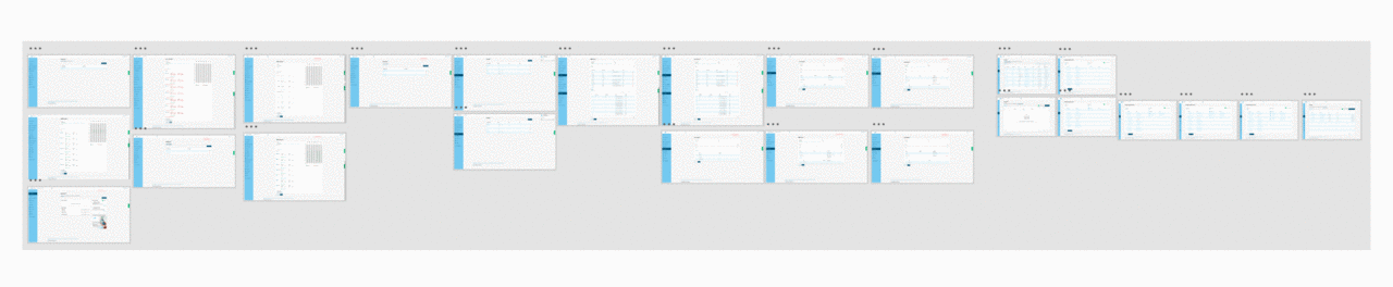
Scheduling was the most-used and most-broken part of the platform. A schedule was a reusable block of time that held up to 70 slots and could attach to eight or nine different things. Elegant for engineers, unusable for people: in testing, every user failed on the first try.
The instinct was to make the model easier to learn. I threw it out instead. Managers don't think in reusable time blocks; they think "who can go where, and when." So I bound scheduling to the group it actually describes, set access times right on the group page, and deleted the standalone scheduling section. We lost a whole section of complexity and not a single real capability. That's the simplicity worth fighting for: not fewer features, but the same power expressed the way people actually think.
Setup hadn't changed in a decade and took five to seven days. Customers spent hours on calls trying to work out what hardware and licenses fit their community, and plans were priced by device type, which community managers didn't understand. I sat in on those calls and heard the same questions every time, so we put them in the product. The wizard asks how many residents, units, gates and doors, and whether they want video, then recommends exactly what to buy.
Then I worked with business and sales to price around what community managers did know: their gates, doors and residents. Gates and doors covered the hardware; residents covered app licenses. Twelve plans became one, setup became self-serve, those calls dropped 75%, and time-to-value fell from days to minutes.
UX isn't just the screen. It's everything about dealing with a company. A nicer screen can't fix a broken process behind it.
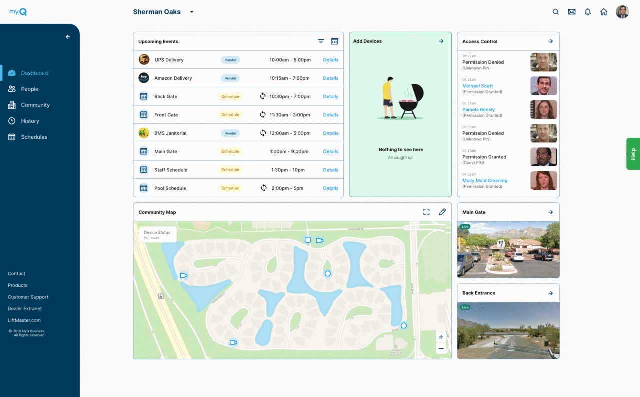
The old dashboard mixed useful things with noise like release notes and ads. When I asked managers what mattered at login, two questions came back: "Is my community safe?" and "What do I need to do next?" The new dashboard answers those first: live status and video for gates and doors, alerts for damage or unauthorized entry with clips attached, and one filterable view of upcoming schedules, guests, deliveries and devices that need attention.
For residents, the goal was less everyday friction: no physical keys, guest access granted from anywhere, and an easy answer to "did anyone come by while I was out?" Each one took a moment of anxiety or hassle out of living in a managed community.
The last piece was a feedback loop, so the platform could keep improving without another rebuild. With the support team, I found that three out of four support calls were troubleshooting: people looking for help that existed online but couldn't be found. So I pulled feedback, support and guidance into one findable, in-context place, and set clear response times so the help form stopped being mistaken for live chat.
This is the clearest example of what I do best: finding the structure underneath a complex system so it feels simple, and absorbing that complexity so users never feel it.