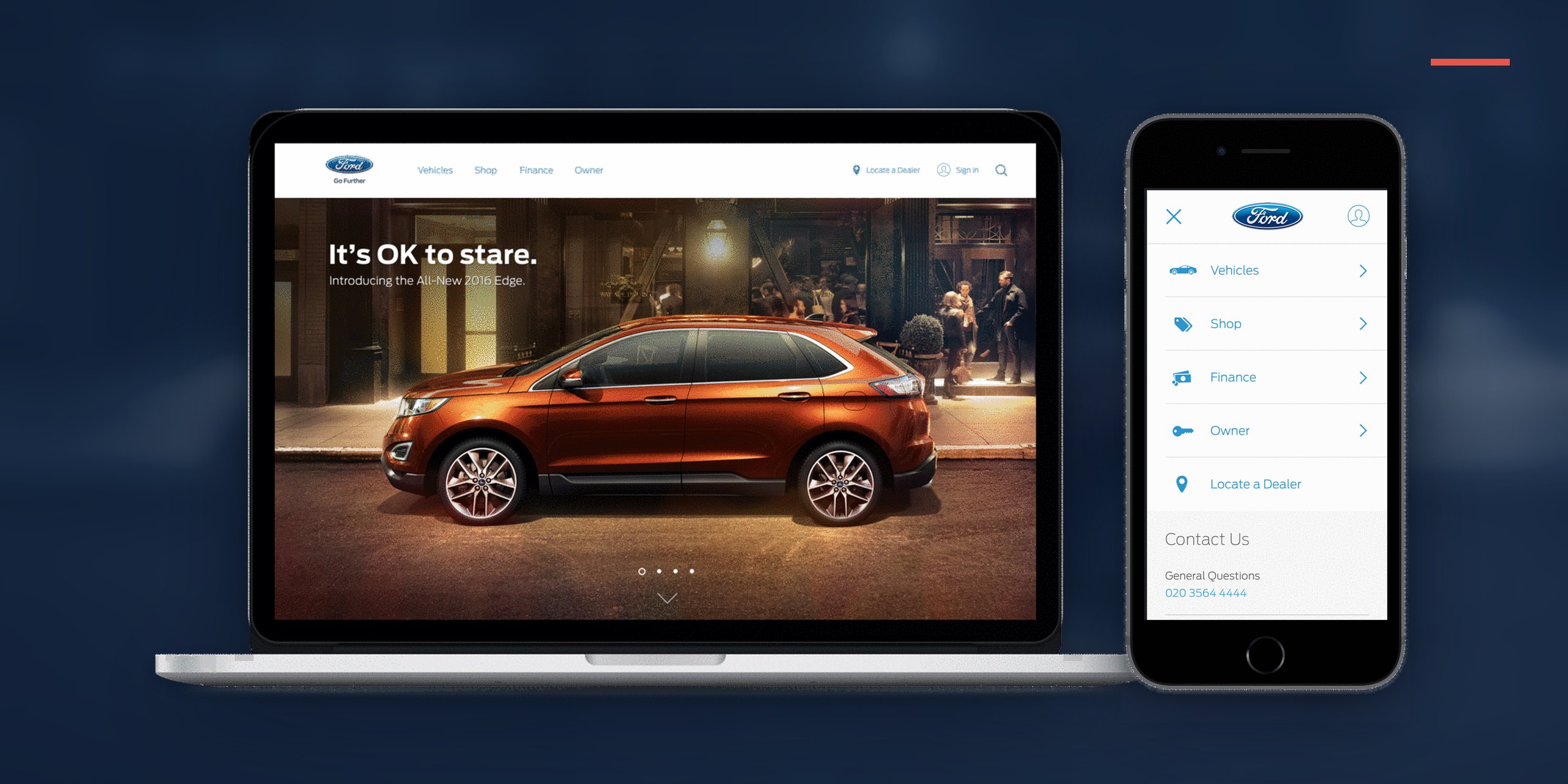
One navigation and one configurator for 100+ markets, built around how people shop, so buyers anywhere could find the right car and walk into a dealer confident.
Each region ran its own navigation and taxonomy, and the site was organized around Ford's model names, which many global shoppers did not know.
UX / Information Architect. I owned the structure of the global navigation and Build & Price, and helped build Ford's first responsive component library, from research through testing.
One navigation across 5 regions and 100+ markets that beat the old ones in testing, lifted engagement and dealer leads after launch, and became the model for what came after.
Five regions with their own menus became one global structure, proven with shoppers in each region.
15 top-level items became 7, ordered by Explore, Shop, Buy, Own, with pictures and prices where names do not translate.
Mobile first, with every desktop feature, built from responsive components and patterns people already knew.
Ford.com was not really one site. Each region had built its own navigation and its own taxonomy over the years, so the same car could sit under different menus depending on where you were. Terms like "SUV" and "compact" did not mean the same thing from market to market, and in many markets shoppers did not know Ford's model names at all. People had to learn how Ford was organized before they could find a car.
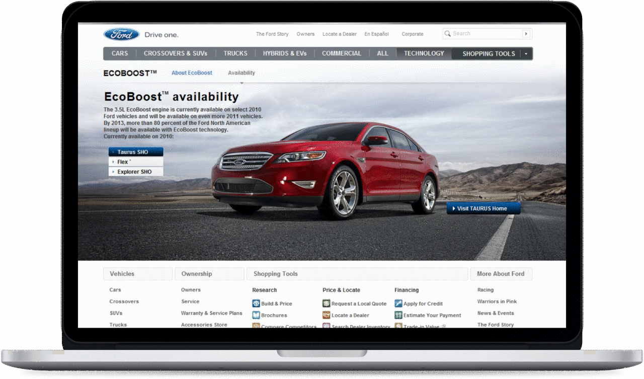

Before (15 elements) and after (7).
The first job was to cut clutter without cutting value. Using testing and analytics to see what people actually used and needed, I prioritized the links and re-architected the top-level navigation from 15 elements down to 7. More than halving the top-level choices reduced cognitive load and made the whole site feel calmer and more confident.
A navigation should help people move through a decision, not just list destinations. Explore, Shop, Buy, Own are the real stages of buying a car, so I restructured the navigation around that journey. The site started guiding people through it instead of mirroring Ford's internal structure.
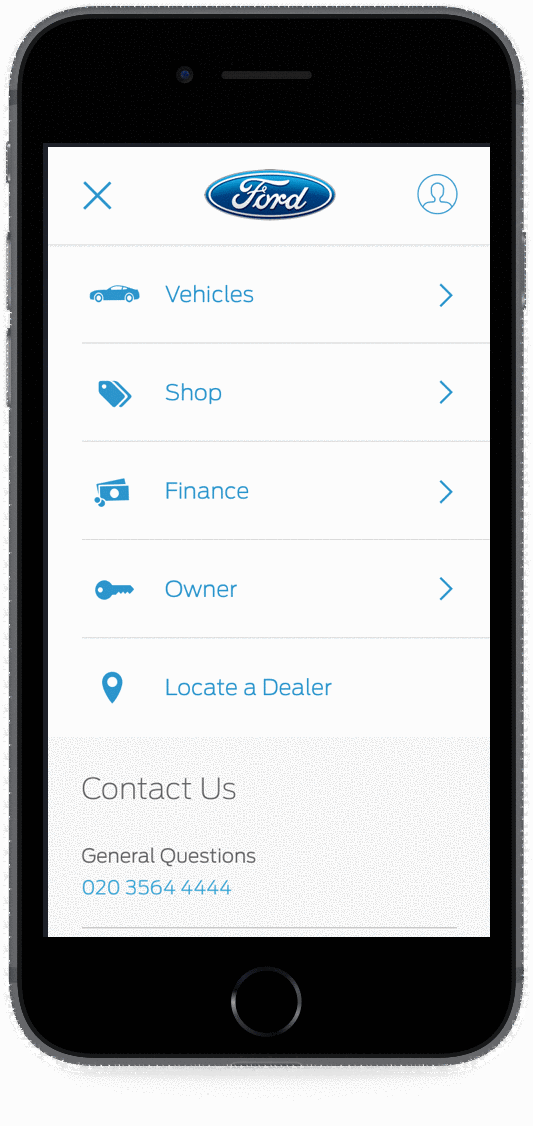
Sorting vehicles into familiar segments was a start, but words like "SUV" and "compact" do not translate from market to market, and many buyers did not know Ford's vehicle names. So I brought vehicle images and pricing into the navigation across all screen sizes, the two factors research identified as the biggest decision points. People could recognize and compare vehicles visually, whether or not they knew the names.
The easy path was letting each region keep its own navigation. Every region pushed back with the same line: "You don't get our local market."
I didn't argue opinions. We tested the global navigation, built around how people shop, with shoppers in each region, and the simpler version did better in all of them.
I started mobile first, the most useful constraint in this kind of work because it forces priority. On a small screen every piece of content has to justify itself. The bigger structural decision was to design components, not pages. I helped build a library of responsive components, navigation, vehicle cards, feature cards, pricing, each with its own layout for small, medium, and large screens. Thinking in modular parts kept the experience consistent and far easier to develop and launch on a global scale.
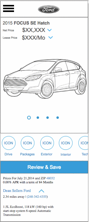
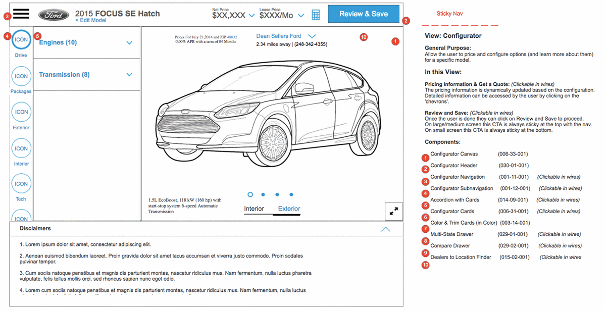
The first big question was whether to show results at the vehicle level (Ford Mustang, Ford Focus) or the model level (Mustang GT, Focus ST). Research answered it. In many global markets, shoppers were not familiar with Ford's vehicles, let alone the trim names, so a model-level list would only confuse the people it was meant to help. We also learned the two biggest factors in a buyer's mind were vehicle type and budget. So I let the data set the filters: show vehicles at the vehicle level, and let people narrow down using terms they already understood.
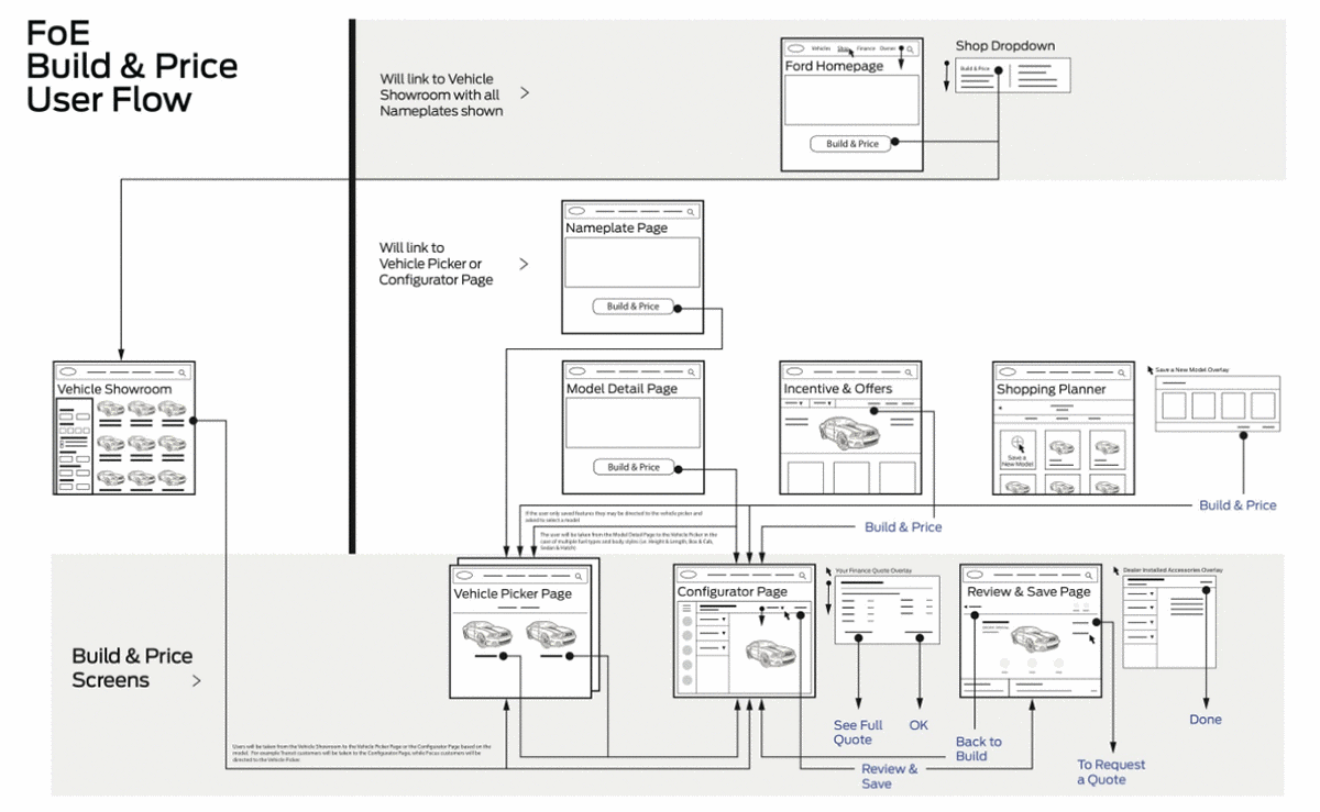
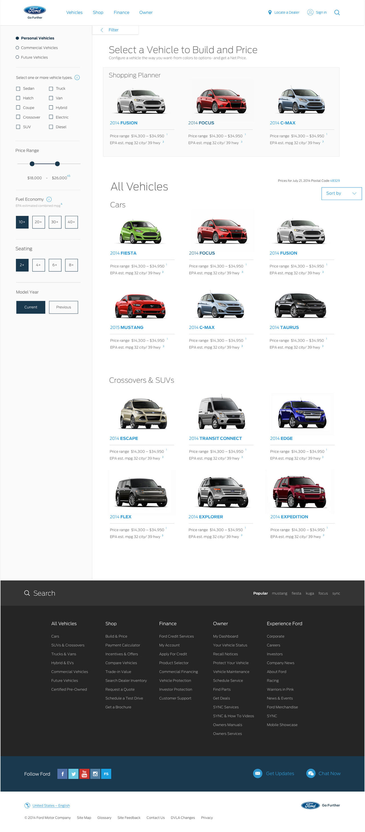
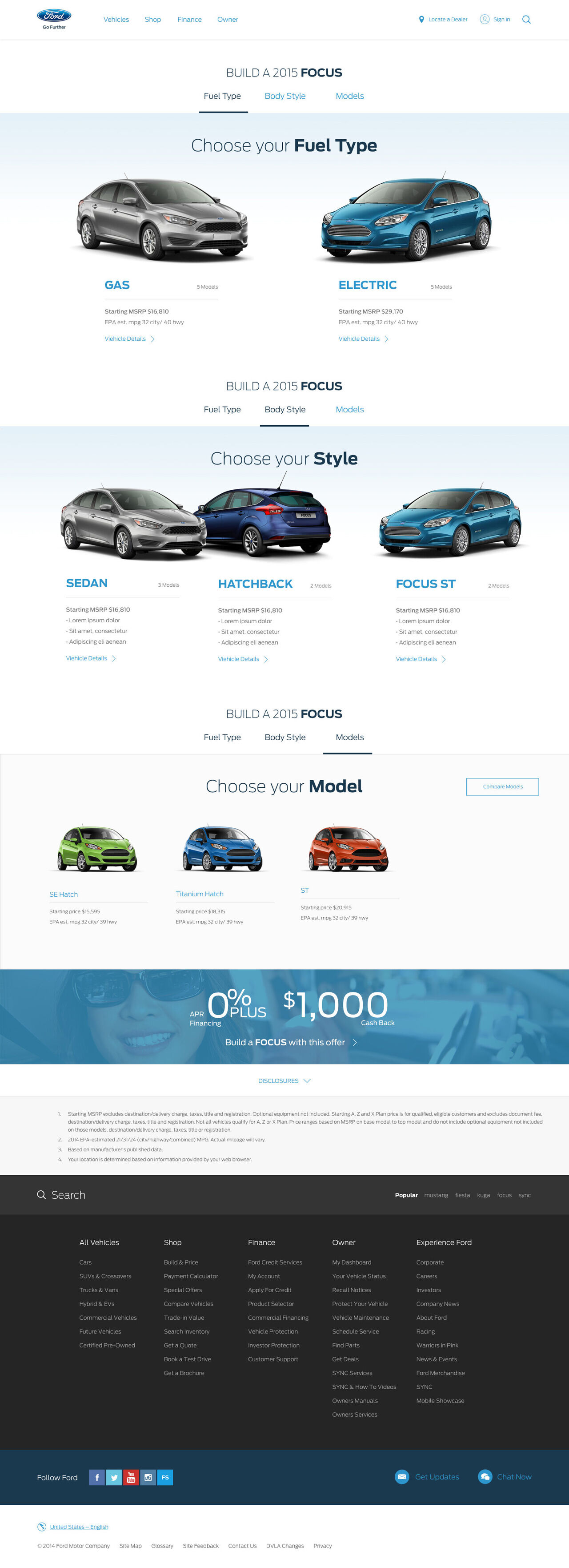
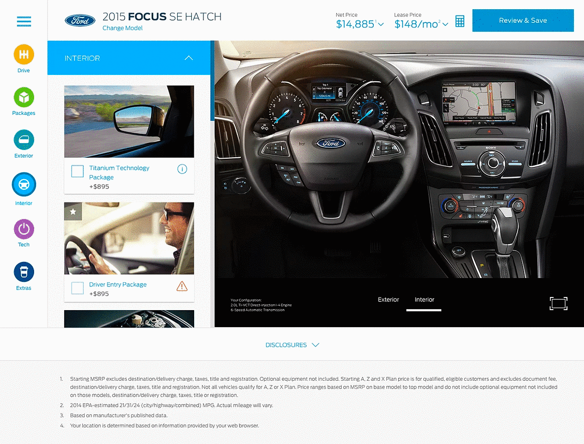
Most vehicle configurators were linear, step-by-step flows, and I did not want that. So instead of studying other car tools, I asked a different question: what do people already customize on their phones every day? The answer was photos and video. I borrowed the patterns people knew from photo-editing and social apps and applied them to building a car. That cut the learning curve for new users and made customizing feel less like operating software and more like something they already enjoyed.
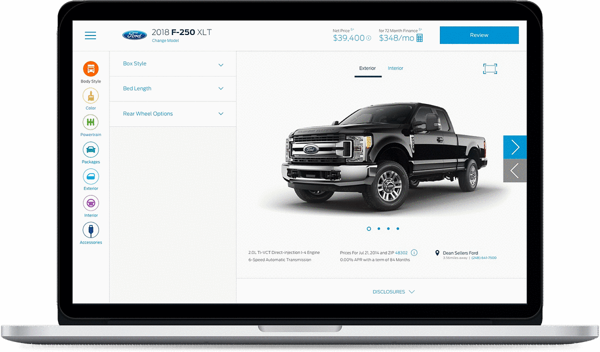
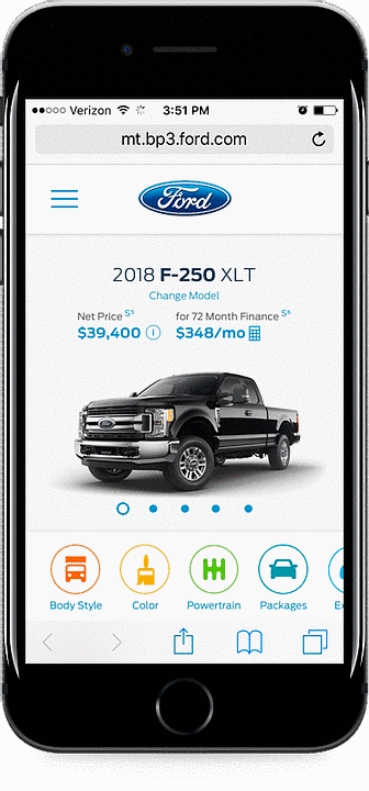
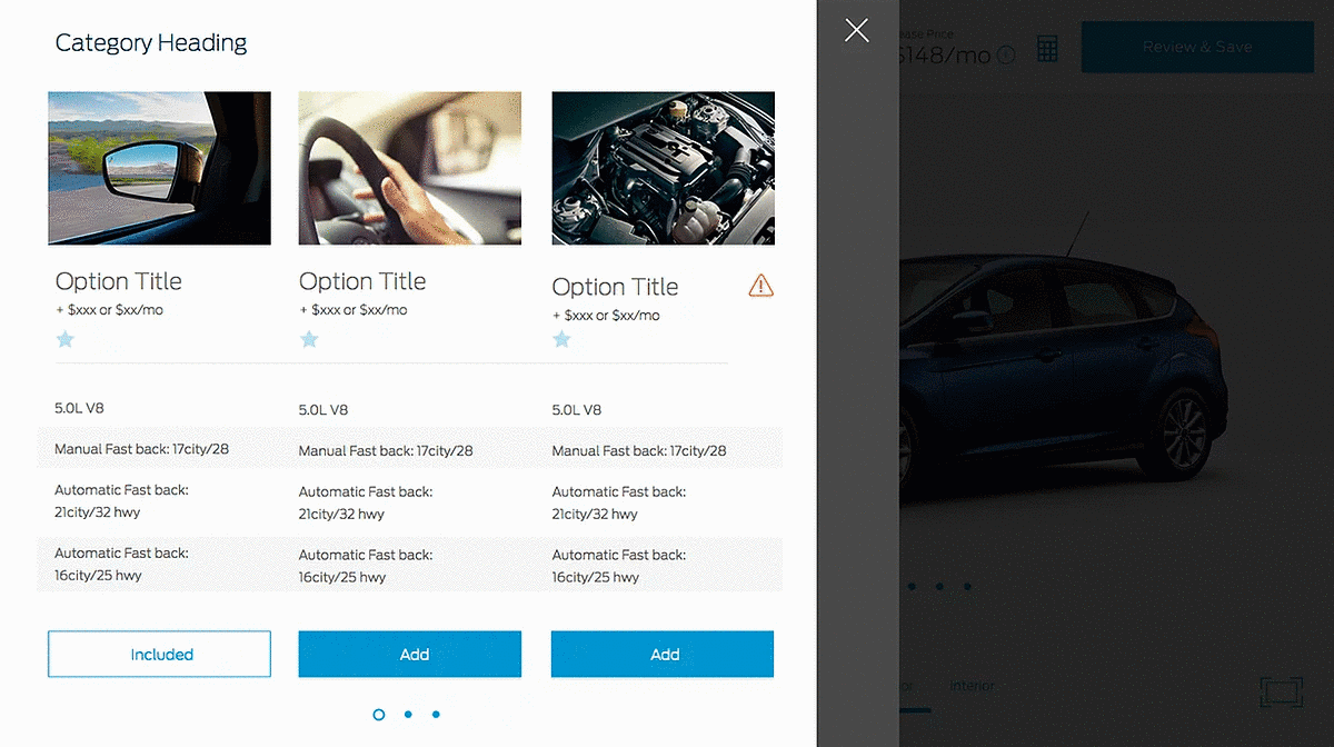
Pricing is one of the moments a purchase is won or lost, so it could not be buried. I kept price present and dynamic: on every feature card, and a running net and lease price always visible at the top, updating live as the build changed. Each feature card carried an image, name, and price, plus an information control for deeper detail, surfaced without interrupting the flow. An informed buyer is a confident buyer.
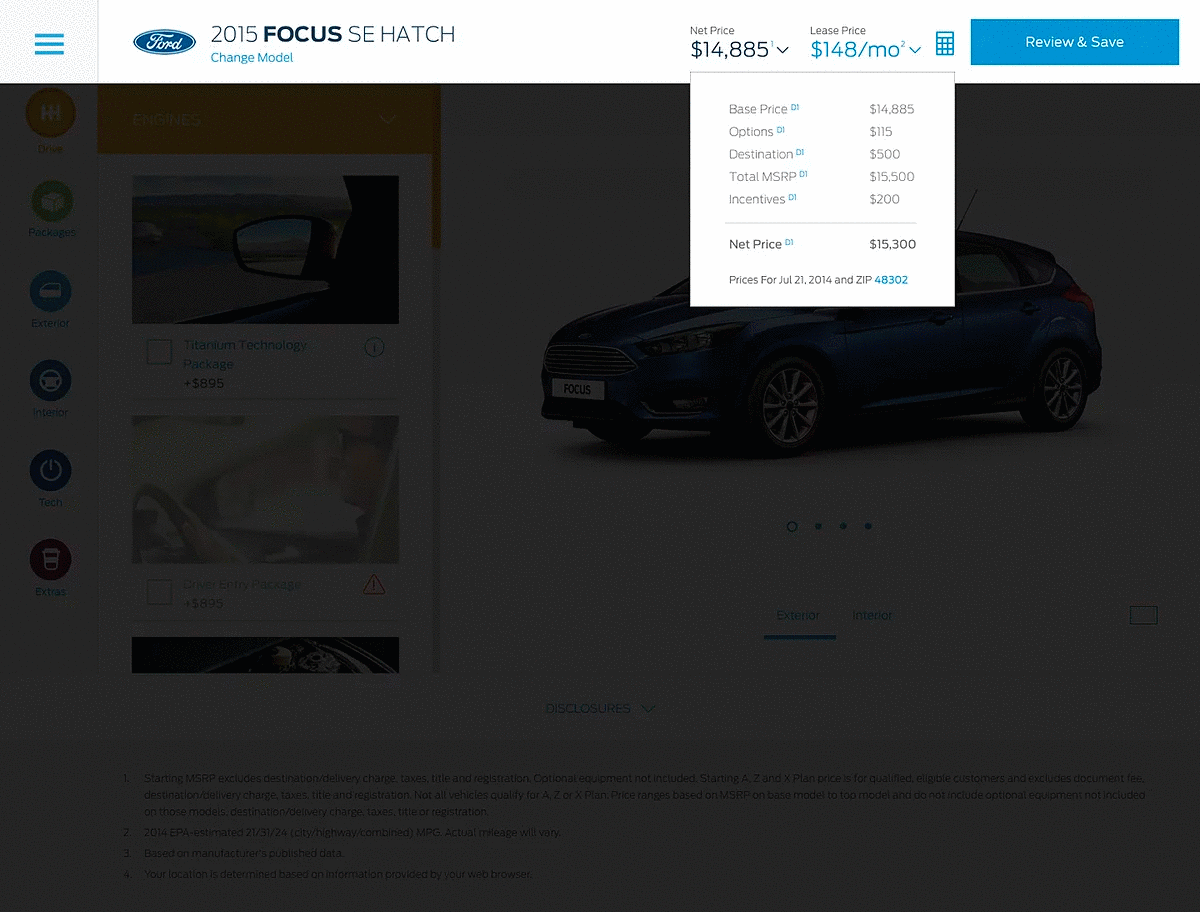
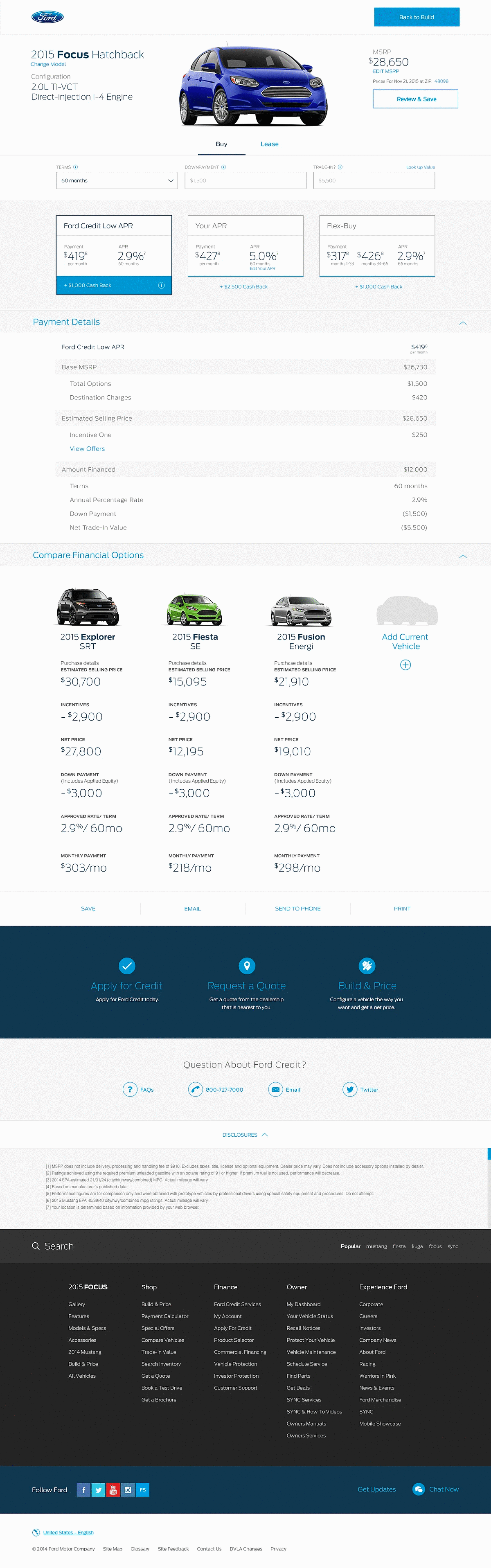
A fully built, fully priced car is not the end of the journey. I designed a payment calculator so buyers could compare ways to pay, with pricing cards that laid out monthly payment, APR, and incentives side by side. Then an Inventory and Locate a Dealer step found the nearest dealer and the best-matching vehicles in inventory, and let the buyer email or print their exact build to bring in.
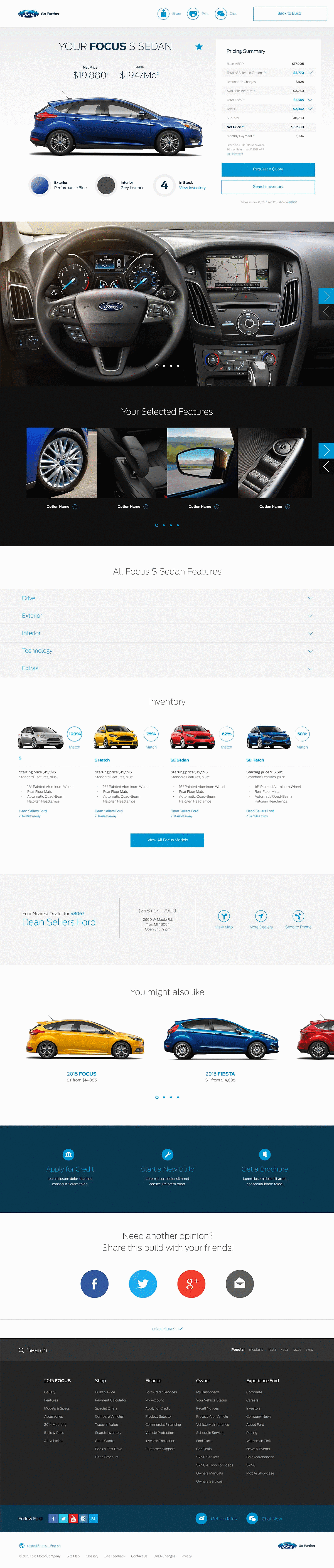
The easy path on mobile was a lighter version with fewer options. I held the line that a shopper on a phone should be able to do everything a shopper on desktop could.
We built modular components that reflowed across screen sizes, broke the build into one step at a time, and borrowed the tap, swipe and filter patterns people already knew from photo-editing and social apps.
Third-party testing showed the new navigation beat the old one in every region before launch. After launch it rolled out across 5 regions and 100+ markets, and engagement, Build & Price starts and dealer leads went up, while bounce went down.
It became the model for what came after: Lincoln and other brand sites, other sections of Ford.com, and a global taxonomy standard across regions, all built on the responsive component library.
Navigation is one of the purest information-architecture problems there is: every decision is visible, and there is nowhere to hide complexity. Across both parts the work was the same. Find the structure shoppers already had in their heads, prove it with evidence, and build the site around it, so a buyer in any market could trust the next click.